How To Write A Creative Brief - Part 2
The one-page CB template that unleashes design magic. Swimwear example + template included.
This is Part 2 in a 3-part series. Catch Part 1 and subscribe to get Part 3 direct to your inbox. This post comes with a template you can download here.
In Part 1, we established that a creative brief isn't just paperwork — no! no! no! A creative brief [CB] provides enough strategic direction to keep designers on-brand while leaving room for creative magic.
You can grab the template that goes with this post here.
Remember our 8 laws of a killer creative brief?
Define a tight, specific target audience
Be concise (designers are visual creatures with short attention spans!)
Include visual references as springboards
Clarify brand values, personality, and emotional objectives
Focus on the emotional core of the problem
Specify how you want people to feel
Balance parameters with creative freedom
Collaborate with designers early
As promised, today I'm sharing my one-page creative brief template — newly updated with the wisdom & insight of Branding Expert Trudie Avery and Brand Consultant Philip VanDusen — and walking you through exactly how to fill it out for maximum impact.
The One-Page CB Template At A Glance
Project Essentials
The Foundation
Target Audience
The Message
Brand Expression
Practical Considerations
The Golden Space
Let's dive in!
Section-by-Section Breakdown
— 👉🏼 1. Project Essentials
This section is straightforward but crucial. It answers the basic who, what, when questions:
Project Name: [Clear, descriptive title]
Brand: [Brand name]
Due Date: [Final deadline]
Key Contact: [Name, role, contact info]
Why it matters:
This creates immediate clarity and accountability. Your project name should be descriptive enough that someone can understand what it is at a glance.
Example:
Project Name: Summer Campaign Landing Page Redesign
Brand: Coastal Breeze Swimwear
Due Date: May 15, 2025
Key Contact: Stephanie Holland, CMO, sh@coastalbreeze.com
Not "Website Update Q2" or "Summer Project." Be specific! Your designers will thank you.
— 👉🏼 2. The Foundation
Here's where we establish why this project exists in the first place:
Brand Purpose: [Why your brand exists - 1-2 sentences]
Project Objective: [Specific business/ brand goal of project - be concrete]
Success Metrics: [How will we measure project success?]
Why it matters:
Designers are problem-solvers at heart. Give them the right problem to solve! As Philip VanDusen pointed out in Part 1, designers need to understand "the why" and "the emotional core of the problem."
Example:
Brand Purpose: To help women 35-45 feel confident and comfortable in their own skin through swimwear that celebrates all body types.
Project Objective: To increase summer collection pre-orders by 30% by creating a more immersive and emotionally resonant shopping experience.
Success Metrics: Pre-order conversion rate of 5%, average time on page increase of 20%, 15% increase in social shares.
Notice how specific the objective is? Not just "sell more swimsuits" but a concrete, measurable goal tied to a specific strategy. The best designers are an extension of your strategy team, not just design output generators.
— 👉🏼 3. Target Audience
This section is where you get to show off your customer knowledge:
Primary Audience: [Specific, tightly defined demographic and psychographic details]
Key Insight: [What do we know about our audience that others don't?]
Current Perception: [How they see us now]
Desired Perception: [How we want them to see us]
Why it matters:
Remember what Trudie Avery said in Part 1? "The tighter the niche, the more we can personalise the brand and really make people feel understood—and people buy when they feel understood."
Example:
Primary Audience: Women 35-45 who prioritise style and comfort, have disposable income but are value-conscious, and feel underserved by the fashion-forward swimwear market that seems designed for 20-somethings.
Key Insight: Our research shows these women aren't looking to hide their bodies—they want to celebrate where they are now while feeling supported and stylish.
Current Perception: A practical, modest swimwear brand for mature women.
Desired Perception: The go-to brand for women who want fashionable swimwear that makes them feel confident AND sexy, no matter their body type.
Do you see how much richer this is than "women 18-80"? Your designers now have a real person to design for.
— 👉🏼 4. The Message
This is where you distill what you need to communicate down to its essence:
Core Message: [The single most important thing to communicate - one sentence]
Supporting Points: [2-3 proof points that support the core message]
Emotional Response: [How do we want the audience to feel?]
Why it matters:
Design isn't just about looking good—it's about communication. Giving designers clarity on the message ensures the visual design will amplify rather than obscure it.
Example:
Core Message: Our new collection lets you look beach-ready while feeling perfectly comfortable.
Supporting Points: 1) Innovative fabric technology provides invisible support, 2) Designed by women over 35 for women over 35, 3) Inclusive size range from XS-3XL with adjustable features.
Emotional Response: We want our audience to feel excited, confident, and understood — like finally someone gets that they want to look gorgeous AND be able to swim, dive into 12 ft waves, and play beach tennis.
Notice how specific the emotional response is? Not just "happy" but a particular flavour of happiness that connects to the audience's real life.
— 👉🏼 5. Brand Expression
Here's where you create guardrails for the creative approach:
Brand Personality: [3-5 specific traits that define your brand's character]
Top 3 Values: [Principles that guide everything you do - vision, empathy, happiness, more examples of values here]
Tone of Voice: [How your brand communicates - conversational, authoritative, playful, etc.]
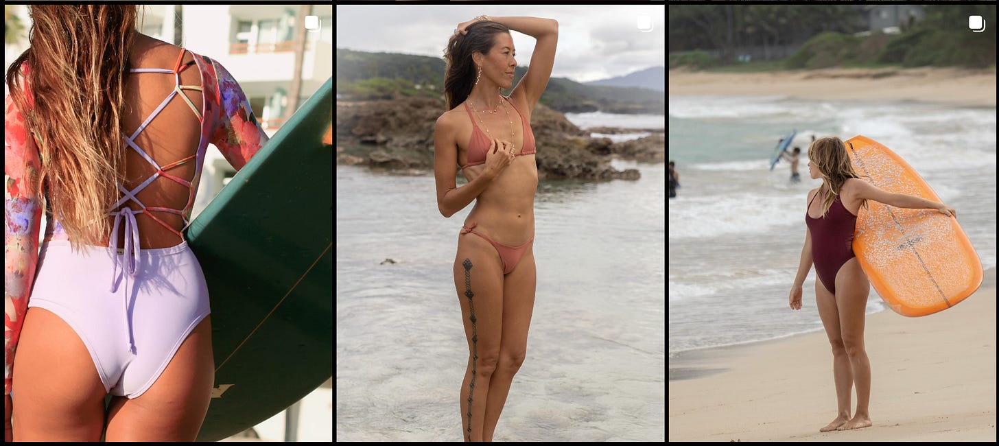
Visual Direction: [Include 3-4 visual references/analogs that capture the feeling you want]
Why it matters:
This is where you help designers understand your brand's character. As Philip VanDusen pointed out in Part 1, visual references give designers a springboard rather than forcing them to start with a blank canvas.
Example:
Brand Personality: Confident, inclusive, sophisticated with a wink
Top 3 Values: Body positivity, uncompromising quality, joyful self-expression
Tone of Voice: Like your most stylish friend who always makes you feel good about yourself—warm, witty, and reassuring without being patronising
Visual Direction:
The visual direction is crucial — don't skip it! Images communicate what paragraphs of description can't.
— 👉🏼 6. Practical Considerations
Now for the nuts and bolts:
Deliverables: [Specific items needed, dimensions, formats]
Constraints: [Budget, technical limitations, brand guidelines to follow]
Timeline: [Key milestones, review points]
Why it matters:
Designers need practical parameters to work efficiently. Nothing wastes time like realising halfway through that the final output needs to be in a different format than expected 🤯
Example:
Deliverables: Desktop and mobile landing page designs (1920x1080px and 375x812px), 5 product showcase modules, hero section with video capability
Constraints: Must use existing Shopify platform, load time must stay under 2.5 seconds, brand typography and colour palette must be maintained
Timeline: Initial concepts by April 30, feedback round by May 5, final designs by May 10, launch May 15
Being specific here prevents frustrating revision cycles later.
— 👉🏼 7. The Golden Space
Finally, here's where you define that sweet spot between direction and freedom:
Creative Freedom: [Areas where designers have room to explore and innovate]
Must-Haves: [Non-negotiable elements that must be included]
Must-Avoids: [Approaches or elements to definitely avoid]
Why it matters:
Remember Trudie's point about the "golden space" between too narrow and too wide in Part 1? This section explicitly defines that space.
Example:
Creative Freedom: Product photography treatment, typography hierarchy, interactive elements, colour application within our expanded summer palette
Must-Haves: Video testimonials from real customers, size-inclusive imagery, prominent size guide access
Must-Avoids: Stock photos of unrealistic beach body models, complex navigation that requires multiple clicks to reach product details, colour schemes that read as juvenile or overly feminine
This section is magic because it says "Here's where you can run wild" AND "Here's where we need you to stay on track" in a way that respects the designer's expertise.
👇🏼👇🏼👇🏼
Making The Most Of Your Creative Brief
The template is just the beginning. Here are three tips to maximise its impact:
1. Involve designers in the briefing process
Don't just email the brief and run. Schedule a kickoff meeting where designers can ask questions and clarify points. You'll catch misalignments early and build stronger creative partnerships. As mentioned: think of them as an extension of your strategy team.
2. Keep it visible throughout the project
Refer back to the brief during check-ins and reviews. Is the work meeting the objectives? Evoking the right emotions? Solving the core problem? The brief should be a living reference point.
3. Evaluate honestly against the brief
When reviewing work, start by assessing it against the brief before giving subjective feedback. Does it meet the objectives? Speak to the target audience? Communicate the core message? This keeps feedback strategic rather than preferential.
The Brief Is Just The Beginning
A brilliant creative brief won't guarantee brilliant creative work, but it makes brilliance possible. It's the foundation everything else is built on.
I've seen mediocre briefs lead to endless revisions, frustrated teams, and ultimately disappointing results. And I've seen exceptional briefs spark work that transforms not just creative output and campaign results but relationships and future work.
Which would you rather have?
In Part 3, I’ll share how I create stunning mood boards with Pinterest & Canva that’ll kickstart the imagination of your design team with colours, textures and design aesthetics. Subscribe to get Part 3 delivered direct to your inbox when it drops.
Until then, download the template, give it a try, and let me know how it works for you!
What's your biggest creative brief challenge? Comment below —I'd love to hear from you!
Typos are my way of checking that you're paying attention, or proof that my brain moves faster than my fingers. (Jury's still out.)
Brandlust is currently free. Consider liking and sharing this post with your friends and colleagues to support my work.


